final work

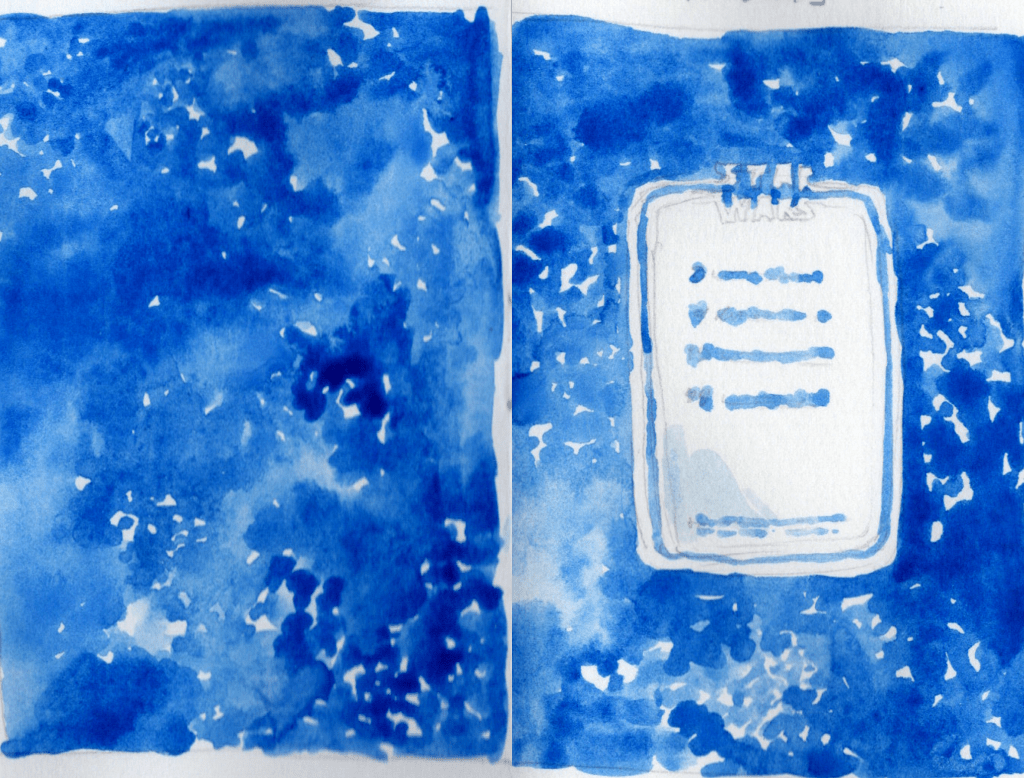
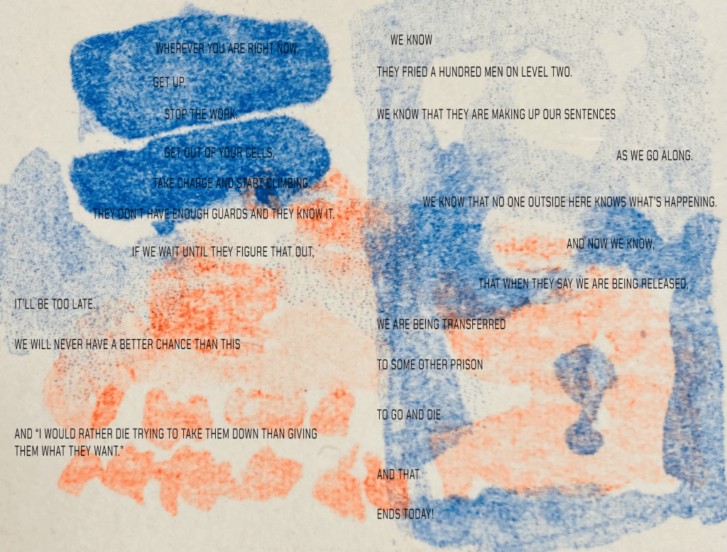
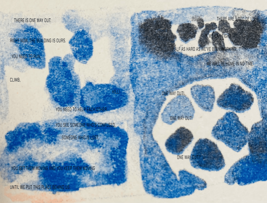
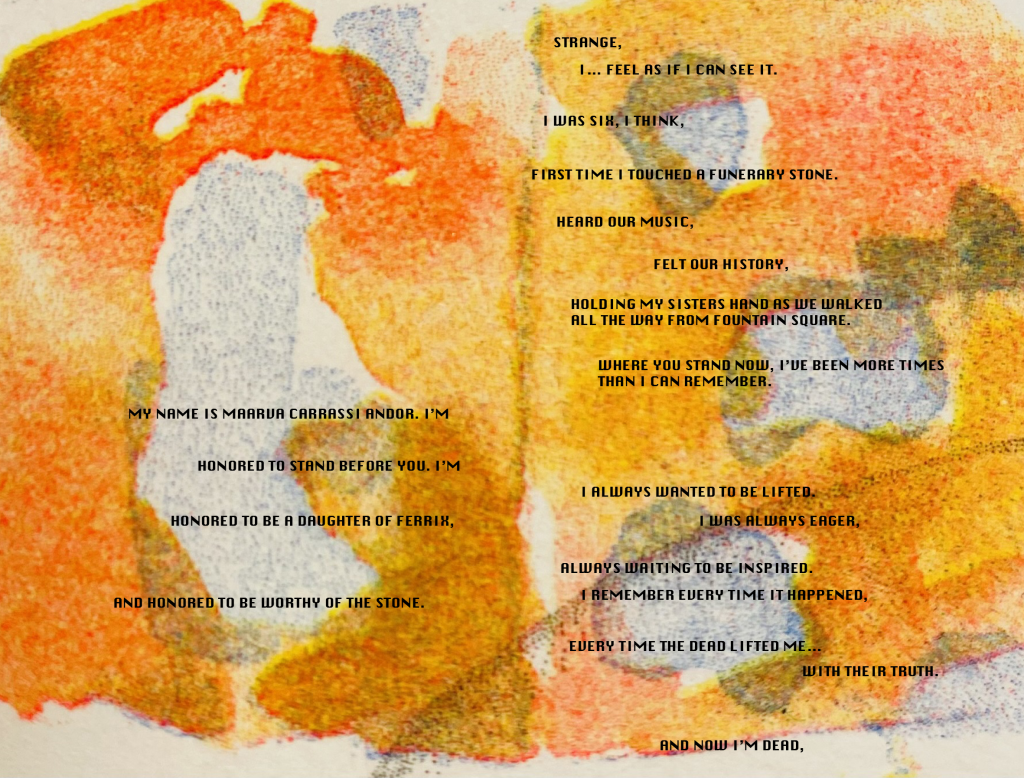
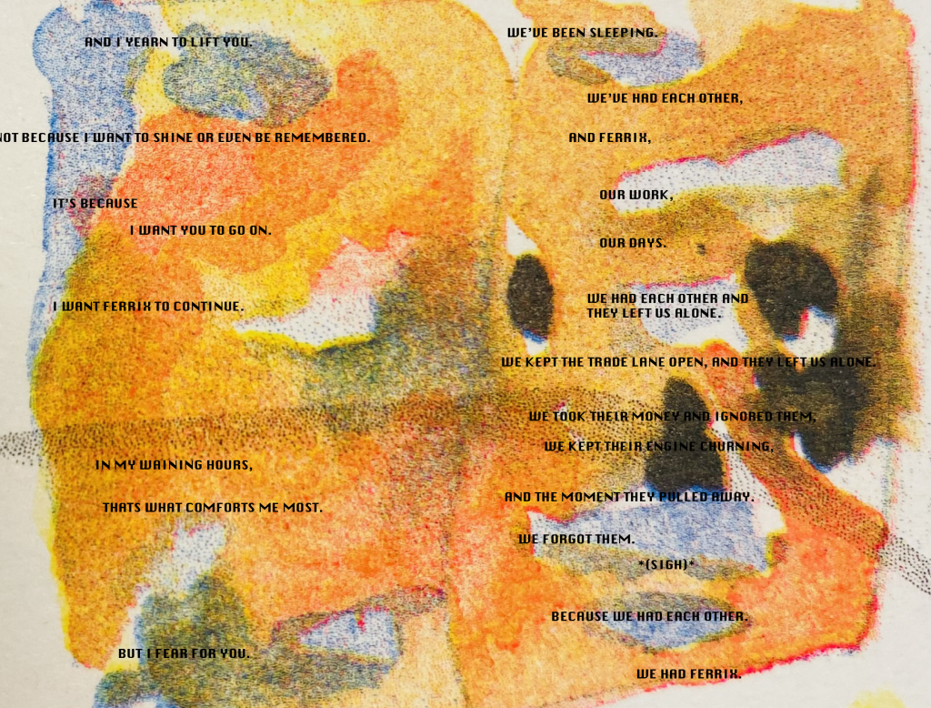
My Visual Narrative project is a proposal for a 28 page risograph comic book illustrating monologues from the Star Wars series Andor, with all pages planned to varying degrees and 1 double-page spread finished so far. I wanted the form of the comic to visually reference vintage Star Wars comics as Andor is widely considered by fans to have brought back the original feel and core anti-fascist ideology of Star Wars as it was back in 1977, the use of riso helping to replicate the aesthetic of old print textures and creating striking colour schemes.
The character’s monologues I selected all centre around the theme of small rebellions and are, what I feel to be, externally some of the most impactful and inspiring scenes from the show as well as internally hold great importance in the history of the beginnings of an organised rebellion in Star Wars.
Each separate monologue will have a slightly different visual style from one another to suit their specific character, context and message. This includes a varying approach to the figurative scale in terms of depicting the actual scene from the series, the visual metaphors and references in the words, and the more abstract elements including atmosphere, soundscapes and music. The visuals are varied and made distinctive from each other through; specific riso ink colour combinations, use of splash pages vs more segmented panel pages, the typeface the monolgue is written in, rules in regard to speech bubble formats (no box, bubble, square, etc), and the level to which the visuals are abstracted from the original source material.
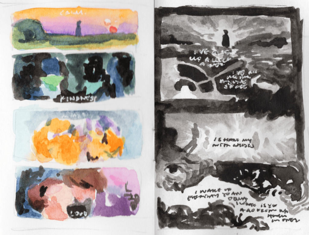


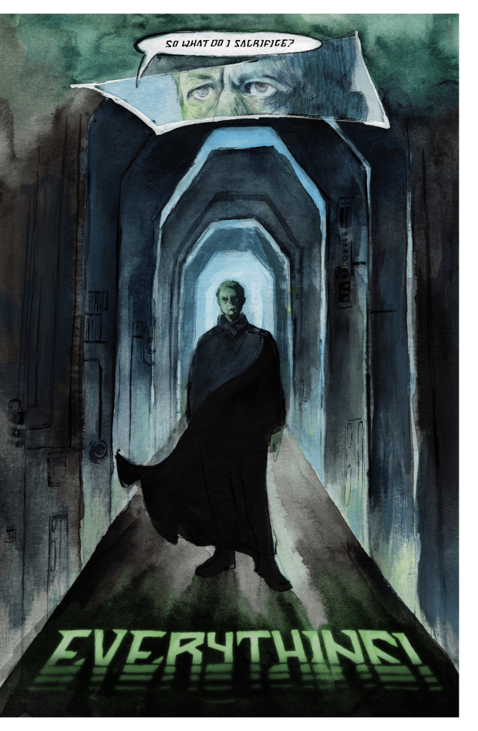
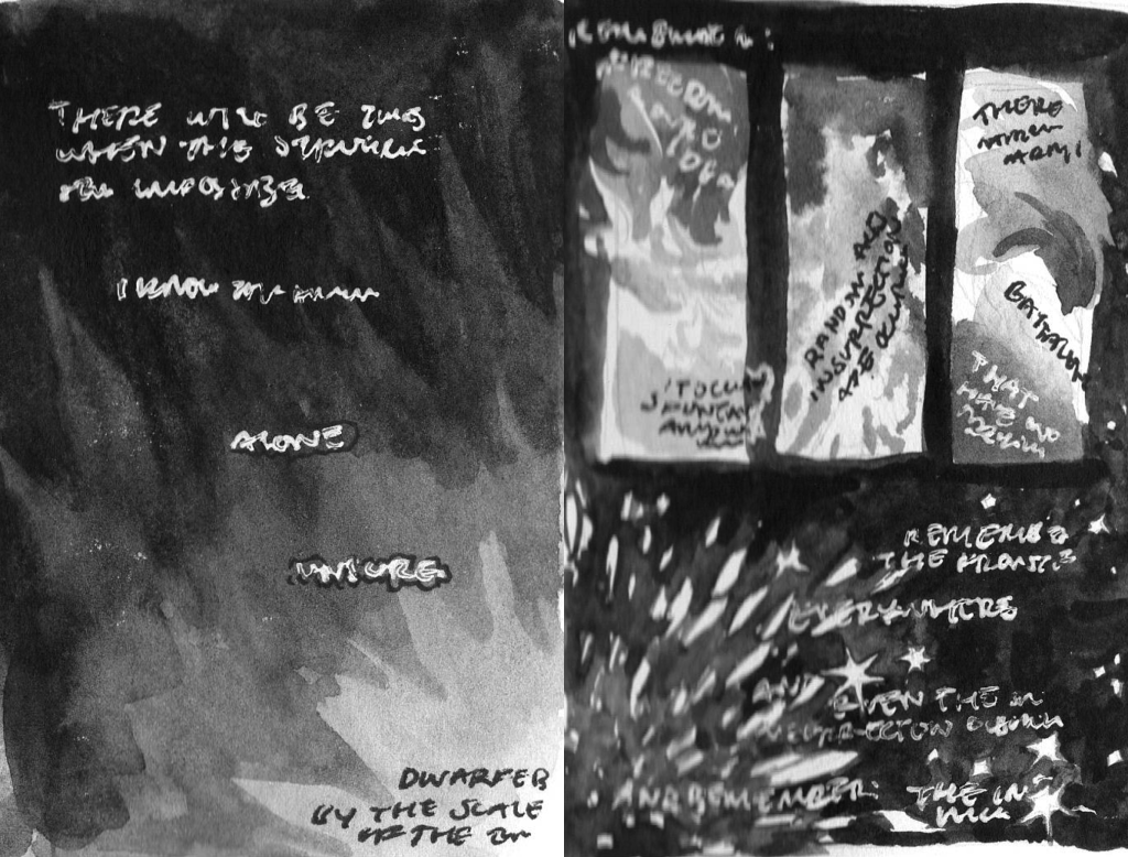
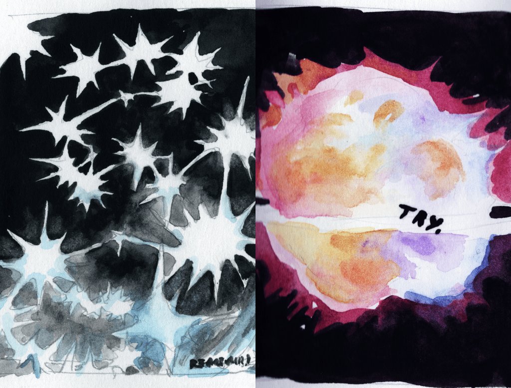
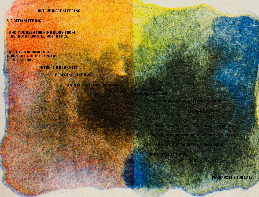
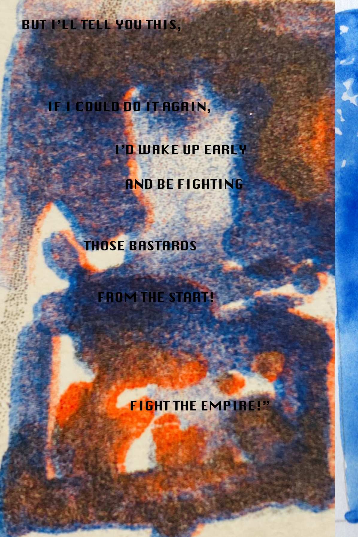
Luthen’s monolgue begins with a hazy dream aesthetic, unclear visions of futures (we know will come to pass in the Star Wars universe) that Luthen can only hope for as he accepts it is a future he will never get to see. The following pages are structured based on visuals of burning, crumbling, and shattering as Luthen laments how he must destroy his own conscience for the sake of the greater good, with the burning page referencing the 17th century religious painting The Fall of the Damned. The final spread mirrors Luthen’s split identities with Luthen at present, as the comic visuals are brought in line with the visuals of the actual scene from the show. The hazy futures aesthetic features again on the shattered page, some of the shards vaguely depicting scenes such as the medal ceremony scene from A New Hope. Luthen’s cloaked silhouette stands on the last page as the background echos the declaration of his sacrifice.


evaluation
This comic project has lead to the largest development in my way of working as an artist, especially in the field of comics. I feel that I have really been able to finally figure out how to effectively structure my working during a project and develop systems for ways of creating more incremental iterations of my thought process. I still spend too long thinking about the content and final designs, I think I need to concentrate on creating more preliminary experimental artwork in the middle stages of the project still so that I have a bank to draw from when putting together finished pieces as well as being a mental aid in me figuring out what things are going to look like earlier on.
One approach to working that I think will change all my future work for the better was more of a focus on drawing as research. I collect hordes of reference images to work from for whatever I’m drawing but it has always been slightly daunting to go from all those photos straight into designing, with this project I began to let myself take the time in just drawing and studying my references so I could really understand what I was referencing when then taking that into my own designs later.
I also found that my motivation to work on this project was the most consistent I’ve had. I love creating my own content and fantasy worlds but I’ve also always loved the elaborate fantasy world’s from other people’s minds as-well, given that being a ‘fan’ of media has been as big a part of my life as making art has. So with the opportunity for the two largest sides of my life to come together in this project I have had the most fun and confidence with my work.
In terms of finishing the whole comic book, I really want to continue it over summer but I think I might have to reconsider how it will be printed. There were as many drawbacks to using the actual risograph printer as there were positives. Whilst riso prints beautifully vibrant colours, creates great texture and is great for printing in large quantities; registration would prove to be a nightmare especially with my style of working and need for readability of such small text in a comic book and the need for double sided sheets of artwork all needing to be alligned exactly correctly; having as many ink colours as I wanted to have varying throughout the book would be expensive to create all the masters for, cause roller makes on the pages, and all the layered ink would mean the artwork would take a very long time to dry meaning it might smudge when trying to be read; also access to the riso machine would be a problem over summer. So considering all that I wonder if it might be better off for my comic to be inkjet printed but I could try and recreate a risograph effect in photoshop so that I can still get the vintage texture I was wanting.
